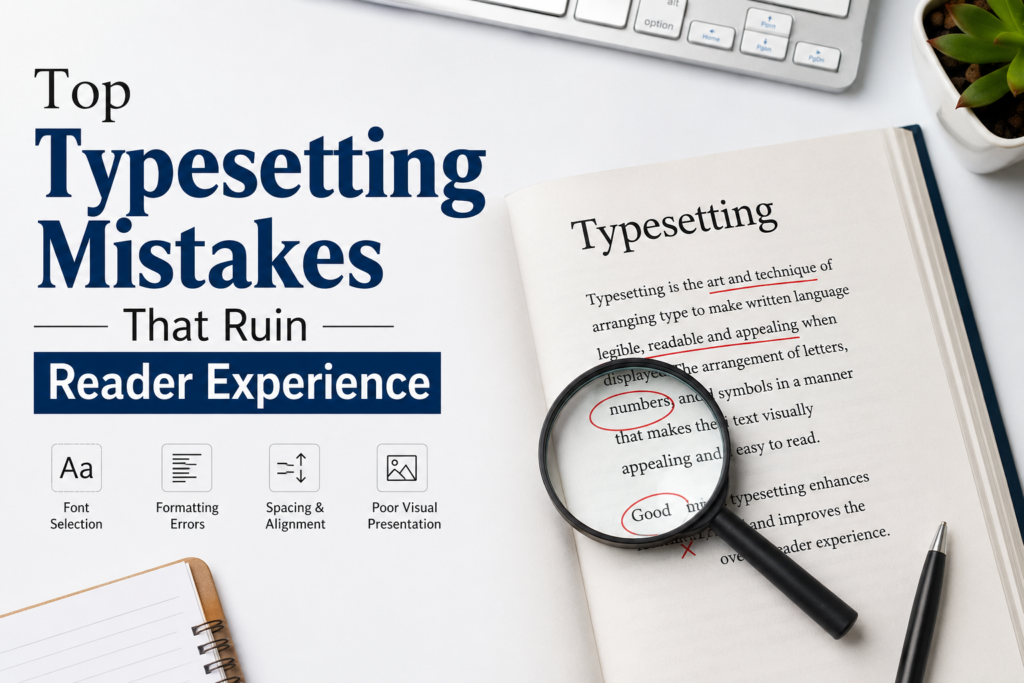
In the publishing world, creating a successful book, magazine, or educational resource takes more than quality content. Even the most important content can lose its impact if the layout, format, and presentation are poor. Here professional typesetting becomes essential. Good typesetting makes text easier to read, more attractive, and more engaging for the reader.
Publishers and authors often don’t appreciate layout design and formatting consistency. Small errors in typography, spacing, alignment, or structure can irritate readers and damage the credibility of a publication. Typesetting determines the reader’s experience in a digital publication, an academic journal, or a printed textbook.
Poor Font Selection
A very common typesetting error is choosing the wrong fonts. Fonts are an essential part of readability and visual comfort. Academic or educational publications can be hard to read with ornamental or over-styled fonts.
Textbooks and periodicals, for example, require neat, polished typefaces that can be read for long periods of time. The layout can also appear unprofessional if the typeface is not used consistently throughout the article.
Professional publishers follow typographic conventions to ensure consistency of typefaces, readability, and proper hierarchy of headings, subheadings, and body copy.
Incorrect Line Spacing and Margins
Another major problem that detracts from the reading experience is improper spacing. Too much text can be daunting, and too much space can be disruptive of flow.
Typical spacing errors include the following:
- very small margins
- Uneven spacing between paragraphs
- Line height variations
- No white space
- Lack of white space
The balanced space helps the reader to concentrate on the information without any interruptions and also improves the visual clarity. This is especially important in educational publishing, where readers spend considerable time learning.
For better learning outcomes, many institutions are now choosing professional typesetting for education text book projects. This is because educational materials need accurate spacing, well-organized layouts, and reader-friendly formatting.
Inconsistent Formatting
Consistency is the foundation of expert typesetting. If the headings, bullet points, tables, captions, and paragraph styles are all over the place, the document will look untidy.
A magazine is supposed to be uniform in its readers’ tastes. Inconsistent formatting can confuse readers and can make them lose faith in the quality of the publication.
Examples are, for example,
- Different heading sizes on different pages.
- Random font switches
- Irregular indentation
- Tables and graphics not aligned
Good typesetters work from pre-established style guides to ensure consistency in their work.
Poor Text Alignment
Reading misaligned information hurts, visually. Misaligned text can create uneven space and awkward gaps.
For example, in the case of
- If not hyphenated correctly, fully justified text can have large gaps between words.
- Centered text is difficult to read.
- If the paragraph is indented unevenly, the layout will be uneven
We use expert typesetting to ensure that it all lines up and reads well
Ignoring Hierarchy and Structure
A clear visual structure is needed to lead readers through text. If the hierarchy is wrong, the reader may have difficulty finding important titles, sections, or important information.
Good typesetting structures typography by:
- Headings’ font weight.
- Spacing between paragraphs
- Paragraph breaks
- Images are in focus
Good layout aids understanding and makes it easy for readers to digest information.
Low-Quality Images and Graphics
Pictures, charts, and illustrations are a major part of textbooks, journals, and professional publications. But bad placement of graphics or poor-quality images can do a lot of damage to the presentation as a whole.
Common errors include:
- Images are blurry
- Scaling the image incorrectly
- Caption placement sucks
- Diagrams that are not in alignment
All visual elements will be professionally published to be optimized for print and digital media.
Lack of Accessibility Considerations
You ignore accessibility, creating barriers for users who rely on assistive devices like screen readers.
Accessibility typesetting mistakes include the following:
- Low color contrast
- Small font sizes
- Missing heading structures
- Non-accessible tables and images
Publishers are spending more on accessible formatting tools to meet international accessibility and usability standards.
Improper Handling of Tables and Equations
Such structures as complex tables, formulas, and equations are often found in academic works. The presence of broken formulas and bad table construction may cause misunderstanding and misinterpretation of the text.
Problems usually include the following elements:
- Tables that exceed the margin
- Broken equations
- Incorrect numbers
- Too much information presented in a compact form
In order to maintain the level of precision, consistency, and professionalism required by scientific works, many universities use the services of a specialized book typesetting agency.
Neglecting Digital Publishing Standards
Today’s users consume content using various gadgets like eReaders, tablets, smartphones, and desktops. If there is no adaptation to the digital medium, the format will not be suitable for print.
Mistakes during digital publication include:
- Non-responsive designs
- EPUB format errors
- Bad hyperlinks
- Poor mobile usability
For flawless user interaction, skilled typesetters guarantee adaptability in print and digital mediums.
Using Outdated Publishing Workflows
The problems with inconsistency and delays associated with the traditional manual method have been addressed by the modern publishers through using XML-based workflow solutions.
With the advent of advanced tools such as DocBook XML composition for journal publishing services, the need for structuring content and making publication faster and consistent has been taken care of.
Such an approach is particularly beneficial for the publication of academic journals and technical documentation, among others.
Why Professional Typesetting Matters
Professional typesetting is not only about putting texts into order; it has significant consequences for the way in which the material becomes readable and engaging. The users have been shown to be more trusting and ready to read professional publications due to their clear structure and professional formatting.
Advantages of professional typesetting include:
- Greater readability
- Improved user experience
- Visual consistency
- Faster publishing processes
- Better accessibility compliance
- Overall improved publication quality
The publishing industry of any type, whether educational, scientific, or commercial, has come to rely on professional formatting standards.
For instance, professional typesetting for education textbook projects should adhere to the highest standards of professionalism since all educational materials need to stay readable and well-balanced in terms of presentation.
Final Thoughts
Typesetting is essential to the success of any published work. Regardless of how good the content of an article might be, it will not have the desired impact on the readers if the formatting process was poorly done. From typographical errors to lack of compliance with accessibility standards, the results of careless mistakes during the formatting process can greatly affect the readers.
Professional typesetting ensures that a high standard of work is achieved. The development of the publishing industry has resulted in the necessity of embracing new technologies in order to succeed in today’s world.